Event Decor, Planning Tips, Student Ambassador, Your Event Career
Event Planner Jobs: Working with Seasonal Color Trends
With every season comes a new opportunity to switch up the decor and design of your event planner jobs! Not sure how to do this? QC Event School’s Student Ambassador, Afton Romrell, is here to help!
Afton Romrell is the co-founder of Eventfully Sweet. She is also a graduate of QC’s Event & Wedding Planning and Event Decor courses.
A Little About Me
Hello, planners! My name is Afton Romrell. I’m a QC Event School alumnus and the proud owner of Eventfully Sweet. I received my certifications in Wedding and Event Planning and Event Decor, then started my business a few months later. Since graduating, I’ve booked 7 clients for the upcoming year. I actually just coordinated a wedding several weeks ago! If you’ve been dreaming of becoming a professional planner, this is your sign to get trained and certified with QC Event School. They’ve played a HUGE part in my rapid business growth!
The Importance of Color in Event Planner Jobs
One of my favorite lessons that QC Event School taught was color. I learned everything I needed to know about which colors work best together, the difference between warm and cool tones, and how color influences emotion. Becoming a color expert also helped me learn about seasonal color trends and how to incorporate them into my event designs. For example, in the fall, rustic tones are common in nature. Think about crimsons, yellows, browns, and so on. In contrast, winter displays more greens, whites, and blues. Although Mother Earth displays these palettes naturally, helping a client create a color scheme can be one of the most difficult parts of an event planner’s job – especially when it pertains to seasons!
Seasonal Color Trends
We’ve all seen articles about what “Spring vs. Fall” colors are. Moreover, you’ve probably noticed the shifting trends of wedding colors over the years. With fads constantly fading in and out, it can be hard to please a client if they want a color scheme that doesn’t necessarily mesh with that particular time of the year. For example, a bride-to-be might want orange and yellow accents for the groomsmen – but the wedding’s in December.
We can probably chalk a lot of this up to the COVID-19 pandemic, which shifted many marriage plans. For instance, tons of people may have had a celebration originally planned for the summer season, but now need to do it in the fall. As a result, they may want to keep their original color palette without taking the shifting seasons into account.
Universal Colors to Use in Event Planner Jobs
Balancing the client’s needs with the right color patterns can sometimes feel stressful, but it CAN be done! If you’ve ever struggled with this – or you’re concerned that this will eventually happen to you – the good news is, this article’s for you! As it turns out, I have found that there are some color schemes that work with ANY season!
Here are a few of my personal favorite all-season color combinations:
- Pink, blue, and ivory
- Green, navy, pale blue, and gold
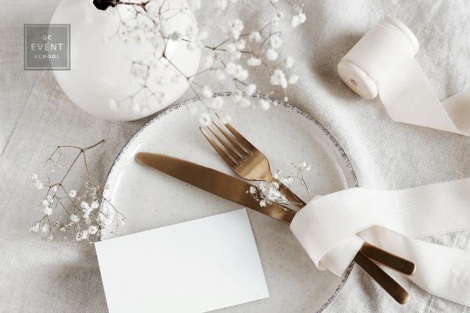
- Muted neutrals
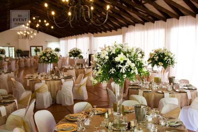
- Green and ivory
- Peach, sage, and light blue
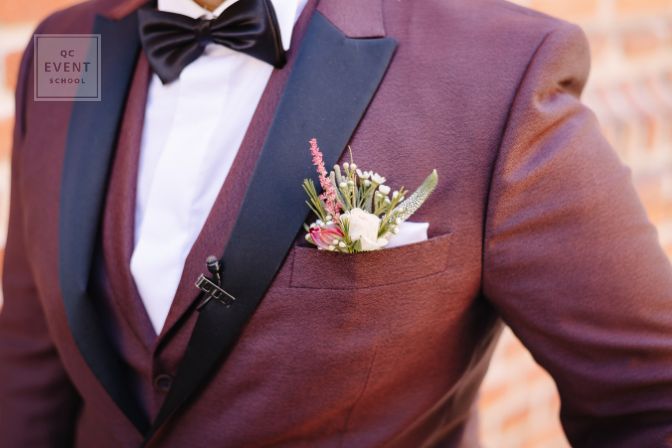
- Burgundies
- Green and black
Matching These Colors to Your Clients’ Events
If you’re having a hard time matching the above list of color combinations to your event planner jobs that currently feel a little “off season,” here are some tricks I’ve used in the past to make clashing colors work together…
Tip #1: Switch accent colors!
If a color just isn’t working, talk to your client and see if they’re open to changing out an accent color that still matches the primary color. This way, it’ll be easier to tie the event to the feel of whichever season the celebration takes place during. For example, say you were using a burgundy color palette for a fall wedding, but then the client has to switch their nuptials to the spring. You can easily add a light pink as an accent color to the main burgundy palette. As a result, this will help incorporate that light spring feeling!
Tip #2: Change the color shades/hues in your event planner jobs!
If the accent doesn’t work, try shifting a shade or hue. For example, you could easily change a navy blue to a cornflower blue, and they’d both be just as beautiful with their primary color. Thus, allowing for a win-win with both the client and the seasonal atmosphere!
Tip #3: Maximize patterns and prints!
Let’s say that your client’s event was originally supposed to take place in the winter, but has now been moved to the spring season. Showing bright spring flowers on items like stationery, napkins, and clothing (instead of a snowflake pattern) can bring your color scheme back to life! Plus, it will help the guests naturally understand the season the wedding is taking place in.
Tip #4: Take advantage of seasonal flowers in your event planner jobs!
Flowers will be one of the easiest things to change around when it comes to coordinating a color with the season. After all, flowers come in all colors! As such, there will always be a flower that’s “in season”. For example, anemones are a perfect winter AND spring flower. Sunflowers are another versatile example, as they can be used in both the summer and autumn seasons.
Tip #5: Venue location!
Many people have changed their venue location due to COVID delays. For instance, your client might’ve originally had an outdoor venue for a spring or summertime celebration. But then, thanks to the pandemic, they had to switch their event to, say, the winter. In such a case, you’d need to work with the client to now find an indoor venue that can work just as well with the color scheme. Lucky for you, there are plenty of options that’ll be at your disposal! Plus, it’s all too easy to adapt the event’s decor to work for an indoor setting.
In Conclusion
Color is amazing! In any season, there are a variety of options you can play with in order to keep your client happy and satisfied. Every season has a color palette, but with a few tricks, you can make anything work. I know I have!
Happy planning!

Thanks for writing this Afton! Such a great read and I love visualizing the color combinations!!
Afton!! What a great read!! I love that you gave us a few of your favorite color schemes. We share a love for muted neutrals!
That’s so awesome that you and Afton share a similar love for muted neutrals! <3 Thanks so much for reading and commenting, Tamesha. We're glad to hear that you found Afton's insights so interested and beneficial. <3
All the best,
The QC Team